
Coordimoves
C2B consumer marketplace for movers searching for moving companies and offers.

THE PROBLEM: Movers spend too much time researching moving companies and getting quotes, when moving is already so stressful. A marketplace is needed that can compare offers, and quickly connect businesses to comsumers to save time rather than waste it.
THE SOLUTION: Validate whether the need for a moving company marketplace. If this correct, then design a platform based on user research that solves this issue.
MY ROLE: sole UX/UI Designer & Researcher
PROJECT DURATION: 8 weeks

After narrowing the market fit through competitor analysis, user Interviews clarified what process individuals use to accomplish an intercity move, and what pain points are experienced while moving. Some user interview questions included:
What are users’ feelings about moving and why?
How do users organize information and research when moving?
Why do some people choose to use a moving or cleaning company and others not? How has using a company aided or worsened the experience of moving?
For those who do not hire cleaners/movers, what are needs that could be solved with marketplace?
Affinity mapping of user interviews uncovered several themes, opportunities and pain points on intercity move coordination:
Different approaches and processes to organizing a move
Difficulty of coordination in former or future city, depending on where you are. For example: finding a temporary residence until permament housing is found; or flying back to former city to supervise movers; coordinating with leasing office in future city
How to get rid of old items; how to obtain boxes
Difficulties of moving with pets
DISCOVER & DEFINE
A Competetive Analysis uncovered the missed opportunities by existing moving companies and online products. This analysis revealed desirable features and experiences that would help create the most beneficial product for Coordimoves users.
Research focsed on 3 competitors: Move Advisor, Dolly, and Unpakt. View complete Competitive Analysis.


After constraining the platform needs through research, I settled on a “Google Flight” style search product that would save users time and do their moving company research for them. Moving company offers would be consolidated on one site, thus leaving users with comparion and decision making as their call to action.

After constraining the platform needs through research, I settled on a “Google Flight” style search product that would save users time and do their moving company research for them. Moving company offers would be consolidated on one site, thus leaving users with comparion and decision making as their call to action.
I proposed three task flows to achieve this: search, survey and compare.
With an ideal task flow in hand, I moved to develop the user flow to plan for the development of my MVP. The user flow added additional detail to the proposed tasks: 1) create a search for offers/companies that could be filtered, 2) search for offers via a survey that filtered results for users 3) allow users to compare different offers/companies side by side to easily arrive at a decision and proceed to the company site to complete their booking.
After considering the ideal steps a user to take to arrive at their ideal offers and moment of selection, I organized those flows into a sitemap.

DESIGN & DELIVER
With my design planning completed, I began my low-fidelity wireframes on paper. Paper sketches allow me to think more freely, and attempt more ideas. I focused my first sketches on the homepage, survey, and search result screens.
Branding began with logo creation. Conceptually I wanted to reflect the movement that happens in a move. My initial iterations centered around using truck tires for the “oo” in Coordimoves. I was unable to get this idea to look modern and clean enough and tried adding simple movement to the wordmark. Success! The wordmark expressed movement, resized well, and could also be used as a monogram.
The color palette also went through several iterations. The original color choices did not meet accessibility requirements. I kept the blue which expressed trust and consistentcy, and traded mint for a fuscia that expressed youth, vigor and pep.


With branding and mid-fidelity wireframes in hand, high-fidelity wireframes came next.


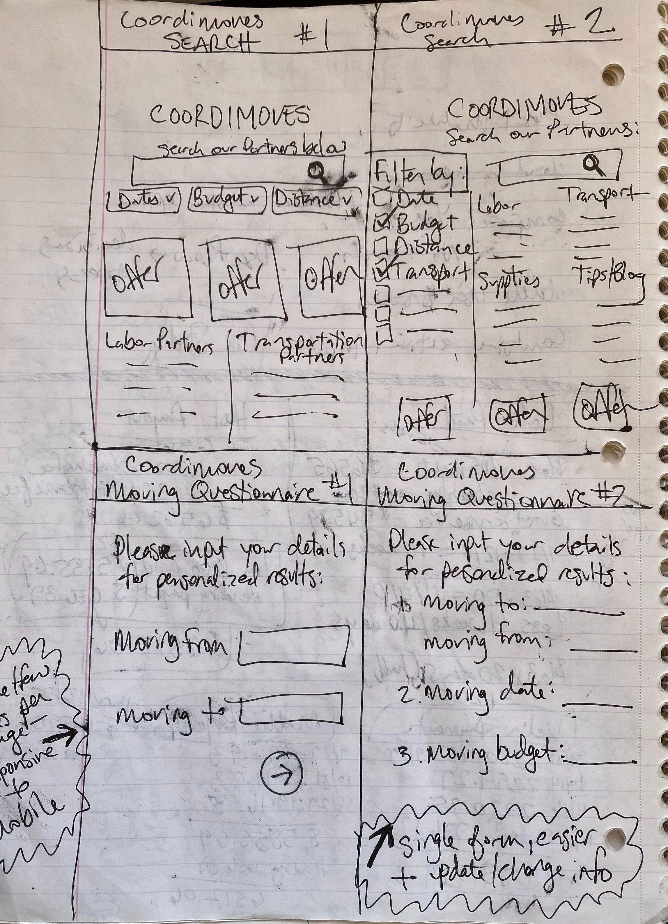

With basic building blocks on paper, I moved back to Figma to build my desktop and mobile mid-fidelity wireframes. I referred back to my user flow, task flow, and sitemap as needed to ensure that users would be able to access and navigate to all needed screens.

6 participants were observed completing 3 tasks via Zoom. Participant feedback was arranged into a Effort: Impact Matrix to prioitize revisions.
Usability Testing Goals:
Do the search, survey, and comparison pages operate as intended?
Are the task flows efficient & free of error?
Is the page appealing & logical to users?
Is the site readable? Are sizing and spacing appropriate?
TEST & REFINE
With hi-fi screens complete a prototype was assembled, and Usability Testing was planned.