Roll Mobility
Optimizing cruicial user flows to reduce user attrition
THE CLIENT: Roll Mobility is a pre-seed startup, C2C mobile app that provides wheelchair users accurate and up-to-date information about the physical accessibility of local businesses and restaurants in the community. This information is gathered via in-app reviews submitted from fellow users, which is the core CTA of the app.
THE PROBLEM: The review feature is clunnky, 19 pages long, and requires nearly 40 clicks to complete. The design fails to communicate progress along the way and includes confusing messaging.
THE SOLUTION: Redesign the review to require fewer clicks, convey progress towards task completion, and become a consistent experience with uniform UI design.
MY ROLE: sole UX/UI Designer & Researcher, alongside one full-stack developer,
PROJECT DURATION: 8 weeks
DISCOVER & DEFINE
User Interviews and Competitor Analysis were the used in primary research. User interviews were essential to empathize with wheelchair users, and hear about the experiences, desires, and pain points of the mobility impaired. Analyzing primary and secondary competitors revealed the market opportunities for Roll as well as new ideas for location review flows.
User Interviews: What problem are we solving?
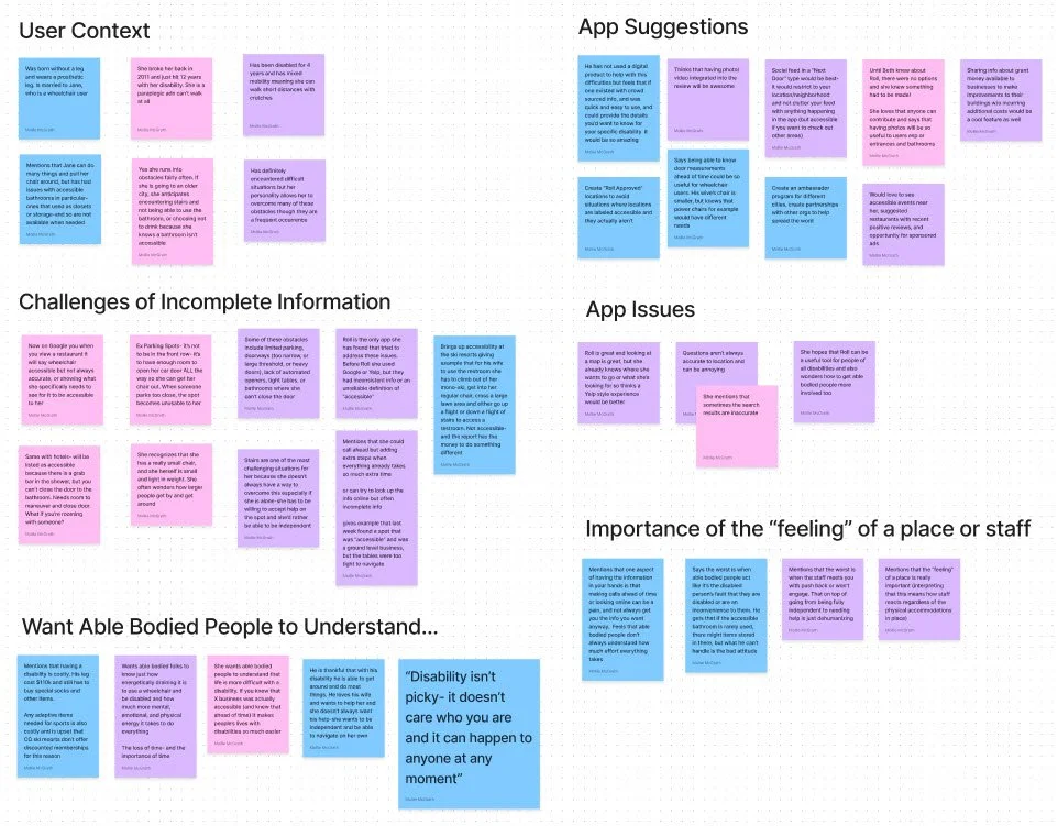
Notable learnings:
Getting accurate & up to date information on the physical accessibility of a business is DIFFICULT! A business owner might check “accessible” on their Google Maps page, but there is no good definition for what “accessble” mean or whether this is accurate
Users want better, objective information. Seeing photo/video info on reviews helps each person assess what is accessible for them individually
⅔ of the interviewees cited that the review questions don’t always match the business type (ie dressing room questions for a restaurant ).
The map view isn’t particularly helpful, and users would rather search for a coffee shop than look at a bunch of businesses nearby.
Competitor Analysis: What is the opportunity?
A selection of direct competitors (other mobility review apps) and indirect competitors (widely used apps like Google Maps and Yelp) were chosen to analyze:
how reviews are written, styled & rated
how specific details vs general user input are utilized in reviews and shown in summary
the length of time/number of clicks it takes to complete a review
how other accessibility apps meet the wide needs of varied mobility challenges users through a brief review
This exercise was both informative and inspirational as I explored different user flows, survey designs, and the usability of each product.
Above you can see the end-to-end review flow of each competitor. At left, you can view the same for Roll. This bird’s eye view of Roll’s flow underscored the necessity to make it more efficient and easier on users.
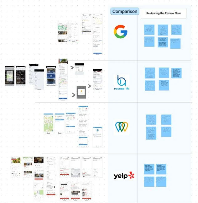


Thorough analysis showed the pros and cons of different designs and new options that had not yet been considered. Upon asking what Roll needed to learn from these examples, many take-aways became apparent:
Consider a chip style component to reduce clicks and ‘carry’ information to multiple areas within the app.
Highlight the meanings of the review icons which are meant to convey: the location rating, bathroom rating, and an indication of full/ partial/ limited accessibility.
Include a review summary with average location score so users are aware of the impact of their review on the location rating.
Include a long-form text answer in the review so users can narrate their personal experience at the business and “speak” to the greater mobility community.
Balance subjectivity and objectivity so that the information remains informative to Roll’s audience. Highly subjective reviews - giving 1-5 star rating without answering specific questions - don’t provide specifics aren’t always useful. More objective reviews - that ask specific objective questions - can be so detailed they become a nuisance and cause attrition.
DESIGN & DELIVER
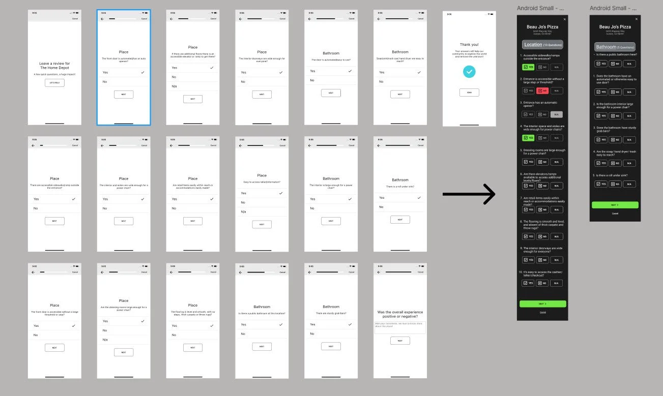
Time to design! My first step was to condence questions onto a single page with a vertical flow. The result took 19 pages of questions down to a single vertical page, reducing clicks by over 50%.
A second review styled with a chip component was also created for stakeholder consideration. Chips were more descriptive, but moving to this style would impact the ability to average reviews into a rating, require substantail refactor for the development team, and therefore was not chosen.
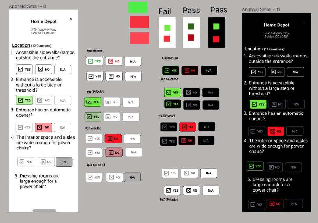
After building team alignment around the yes/no vertical design, we reviewed a light and dark mode. I reviewed color contrast accessibility with all colorsin both modes. I considered spacing carefully as we wanted the questions to be compact while remaining accessible to persons with hand mobility.
The team preferred the dark mode, which better accommodated the existing brand colors, and decided to backlog the creation of a light mode at this time.
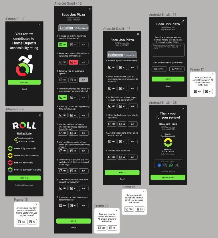
With the color scheme and basic components defined, it was time to complete the full redesign of the review flow.
A consistent dark mode was applied to all pages
Automatic (and optional) user education of the icons used in the rating system was added to display before beginning a review
The option to exit/cancel (with a warning) was placed throughout the review flow
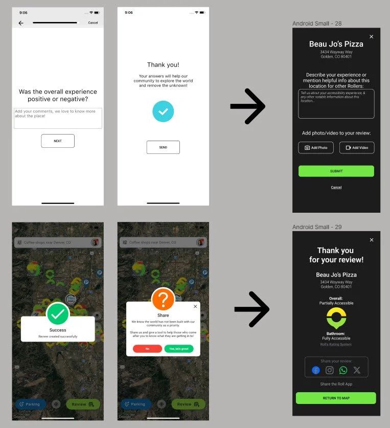
A text box was added at the review endpoint to provide an opportunity to narrate the personal experience, and capture information not expressed with yes/no questions
A feature was added to include photos or videos in the review, to benefit users in determining the accessibitlity of a business for their own unique abilities and challenges
A final review summary was added to show users the impact of their review, and allow them to share the review or the app on their socials, which supports app growth and builds the community
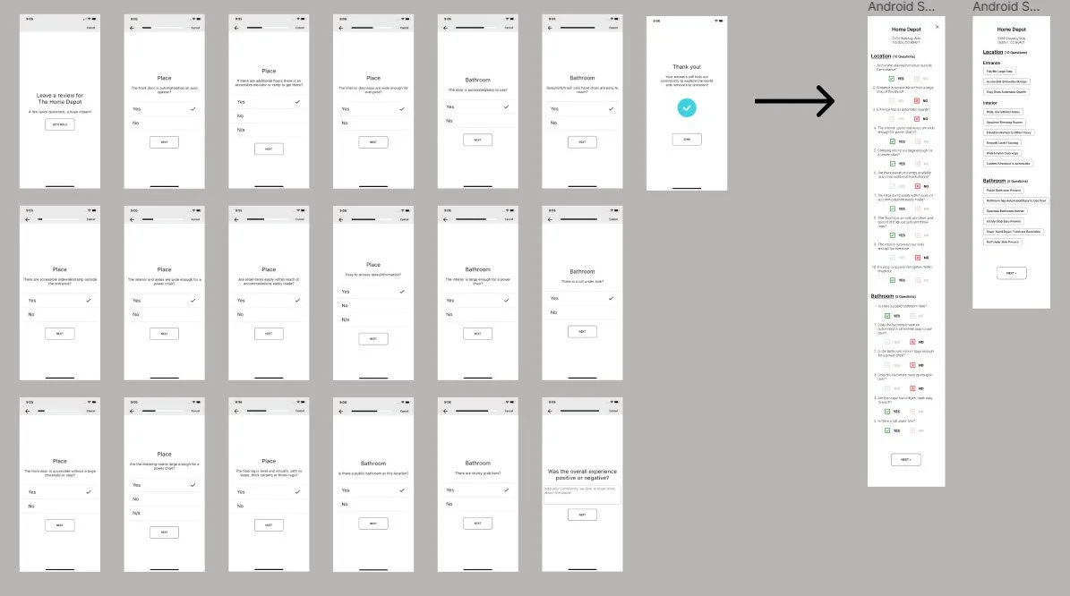
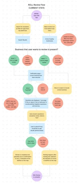
After completing research to define the needs of the design updates, I mapped the existing user flow and noted areas of confusion and inefficiency to kick off how I would iterate on the existing design (far left)
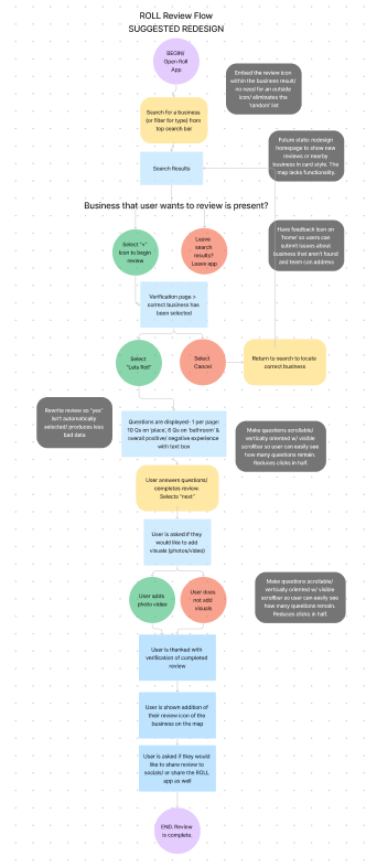
I improved the existing flow to address the problematic area and further inform the design needs (near left).
Notable improvements:
Remove the default “yes” on all review questions, which gathers bad data and bad reviews
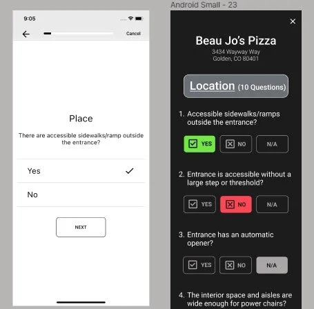
Design questions to be vertical and on one page, so users can see “and end in sign” and track progress
Include a review confirmation upon review completion where users can 1. share the review and 2. see the impact of their review on a business’ accessibility rating
Include a “report an issue” or “submit feedback” area for users to communicate app issues
BEFORE & AFTER
The new design was shared in prototype format for users to experience on their phones. Users were asked for their impressions on the design changes and to comment on what was beneficial, unessessary or missing about the new design.
3/3 participants were pleased with the design enhancements, namely: the rating system education page, the vertical page orientation of the review questions, and the large colorful review buttons. The narrative text box and review summary delighted users.
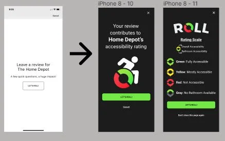
Beginning a Review
The new design is more appealing, sophisticated, and informative.
The consistent use of the brand logo and colors, with improved visual heirarchy creates a cohesive experience. Additional navigation options like the opportunity to cancel eliminate the chance for a user to feel stuck.
Review Question Design
The old design required 37 clicks, was plain black and white, autofilled “yes” for all answers, and did not show any type of progress towards completion of a review.
The new single-page design reduced clicks to 17 , and forced users to answer each question - no more bad data from auto populated answers! Answers were now given by clicking a button, and the brand colors were neatly applied to the page and WCAG compliant. An N/A option was added keep users moving forward was a clear answer wasn’t apparent.
TEST & REFINE
Completing a Review
I rewrote “Was the overall experience positive or negative?” to elicit theimportant details of visiting that business: “Describe your experience or mention helpful info about this location for other Rollers.”
Now, photo and video attachments were also possible.
The last screen of the old design shows a large question mark, several off-brand colors and a confusing message with unclear instructions. I learned this was intended for app sharing. I redesigned this last page to 1) show the impact of the review on the rating, and 2) give users clear instructions to share the app if they choose.
Future feature suggestions from usability testing included:
Add a light mode option for personal preference
Use the rating summary to highlight certain hazards or amenities at reviewed locations
Rework the map icons to be more accessible as the current colors do not pass WCAG and therefore are not accessible to the color blind
Add modals to prompt users to complete reviews at places they have visited, and be able to comment on reviews/locations without completing the full review flow
KEY LEARNINGS
-
The client had a very positive reaction to seeing my thinking about reactions about the app. It was helpful for me to be able to refer to my fresh, initial thoughts after I had been working on the project for a few weeks. This has become an integral part of my process as its utility has been proven again and again to me in UX workflow.
-
Designing for an audience I could not directly relate with was my biggest challenge with Roll. As an able-bodied person, I wanted to accurately represent the needs of the mobility challenged and use the correct language in my designs. The beauty of UXD is that a good process deliberately gets inside the heads of users build empathy for them. Though I was intimidated, I learned to trust the design process and seek more information as needed. Low quality UX design will make many assumptions about users and solutions; high quality UX design will use research to validate designs and decisions and always have a why. I am thankful for this lesson in this project!
-
I found the competitor analysis crucial to creating a successful design for Roll. Familiarizing myself with primary and secondary competitors informed my understanding of what existed in the market, what users were familiar with, and what users needed. Designing a series of questions can seem simple, but my research made me much more effective than I could have been just “designing” out the gate.
-
Start imperfectly and follow the breabcrumbs! Whenever I was stuck in the design and knew my ideas hadn’t matured enough yet, I would feel frustrated and unhappy with my designs. However, getting ideas out—even silly or poorly excecuted—always, eventually led to something I was proud of in the end.
